
Patient Information Leaflets should quickly, safely, and clearly explain to everyone how a product or medication is used. Accessible information enhances safety, reduces the need for follow-up questions, and demonstrates respect for people with diverse abilities. The following practical tips will help you design user guides so that they are accessible and usable by as many people as possible.
Illustrations and Graphics
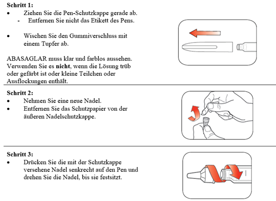
Illustrations and graphics play a major role in helping people understand user instructions, especially when it comes to syringes, pens, and inhalers. However, screen readers cannot read aloud illustrations without additional information.
The easiest way to describe illustrations is through accompanying text in the surrounding text. This makes even more complex illustrations, such as the structure of a pen, easily accessible in an accessible format, and the illustration serves “only” as an alternative media option.
Since contrast sharpness is another important factor for people with visual impairments, the contrast ratio for illustrations should be at least 3:1.
Heading Hierarchy
Structuring the user manual using headings plays a central role in ensuring the accessibility of documents. Strict adherence to the heading hierarchy enables blind and visually impaired users to navigate easily using screen readers on PCs or mobile devices.
Start with the first heading as “Heading 1” (H1). This can be followed by one or more “Heading 2” headings, followed by additional subheadings. An H1 heading can be used at any time.
Use the style sheets for headings that are available in your paragraph style sheet. Avoid using your own style sheets or formatting options outside of the style sheets. This ensures that the hierarchy is interpreted correctly by screen readers.

Structural Elements: Lists and Tables
Structural elements such as lists and tables are important tools for presenting information clearly and concisely.
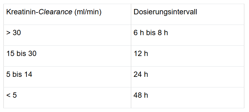
Whenever possible, tables should be replaced with continuous text to improve readability. If tables are necessary, mark the table header and set it to “repeat” to allow for better alignment of the table rows. Keep table structures simple and the number of cells as low as possible.
Tables are most useful when comparing data.